Rapidly growing companies need to make a great impression fast. Your logo helps determine whether people will purchase, apply, partner, or invest. So, your logo must make a great first impression. It can spur growth — or stall it. If you choose the wrong font, you’re introducing your business in the wrong tone of voice and giving a bad handshake. It can determine the fate of your business.
Your logo communicates so much more than your name. It greets every potential customer, employee, peer, and investor. That’s why choosing your logo font shouldn’t be taken lightly. Font choice affects legibility and how fast your company’s name is read. Your logo also conveys your brand’s identity, values, and personality. It even sets the expectation for the quality of your goods and services.
Our design expert answered six important questions to help your business make the right first impression:
1. How do you choose the right font for your logo?
Type evokes feelings. Typefaces have personalities, just like people. Some are strong, reliable, and statuesque. Some are fun, friendly, and relaxed. Some are formal, elegant, and refined. Your logo must speak in a tone that is authentic for you and also resonates with your audience.
So, where do you start? It might sound counterintuitive, but don’t start with fonts! Start by asking what tone of voice is authentic and will appeal to your audience. Is it strong or gentle? Formal or casual? Classic or modern? Once you determine how you want to come across, you can look at fonts and styles. But you’ve got to nail down your typographic tone of voice first.
2. What feelings do different font styles convey?
Your logo’s style, weight, case, size, and spacing communicate your company’s personality. It also determines readability. It can enable instant brand recognition or sabotage it.
Like color, typefaces all carry different meanings and emotions. Sans Serif fonts can project modernity and simplicity, while serif fonts can convey stability and tradition. Script fonts offer elegance, while display fonts portray a more playful or hand-made feeling. However, there are no absolute rules, and individual typefaces can defy expectations.
So, don’t be afraid to try several styles before you find one that speaks to you and your audience. There are many facets of your brand’s personality you can play up, and authenticity is just as crucial as your appeal. It’s also helpful to socialize your logo before you commit. You wouldn’t marry someone before bringing them home to meet the family, so don’t commit to a logo before getting some outside opinions. Ask your colleagues, industry peers, and customers. Their perspective allows them to see pitfalls that might not be visible.
Font choice matters. Beyond style and readability, it impacts your credibility. It will add to or detract from your reputation. Would you hire an attorney with a handwritten logo font? How would that affect your expectations of their legal representation? Do you think they’ll build you a strong case and deliver firmly in the courtroom? Or will they be friendly and playful? Your logo tells a story about the products and services you provide, and the right typeface is imperative for projecting the right brand message.

3. Are there industry-specific font conventions designers should be aware of?
Don’t use extremely common (like Papyrus), as these can be easy to recreate or mimic. Always choose a font that will scale, so check a font’s legibility at small sizes. Don’t choose one with extremely thin strokes or extreme stroke contrasts because those may disappear at small sizes, rendering your name unreadable. When socializing your potential logo, the ultimate failure is when they can’t read your name.

4. What about popular font choices you can’t go wrong with?
Good typefaces are expensive, so more often than not, designers will utilize the same few fonts over and over. While there are many wild and varying opinions on this subject, some classic typefaces for logo usage include Helvetica, Univers, and Futura (for your sans-serif needs), Trajan (this one is often recognized as the movie title font), Bodoni, and Garamond (for serif logotypes).
However, with the increasing popularity of Google Fonts, it’s easy to find typefaces, and entire font families, that you can employ across all your brand’s touchpoints to ensure consistency.
5. What are typography mistakes you should avoid in your logo design?
One of the worst mistakes you can make with typography in your logo design is to use a typeface or typographic effect that sacrifices your logo’s readability or legibility. This kind of mistake could create brand confusion and detract from the credibility of your brand.
Other mistakes include ignoring typography hierarchy, utilizing faux-bolding or faux-italics when a typeface doesn’t offer those font options, skewing or stretching fonts, using too many fonts or weights, adding unnecessary effects like drop shadows and outlines, and ignoring tracking and kerning. When in doubt, hire a professional to ensure your logo doesn’t fail you.
6. What companies would benefit from a type-only logo that doesn’t include a symbol?
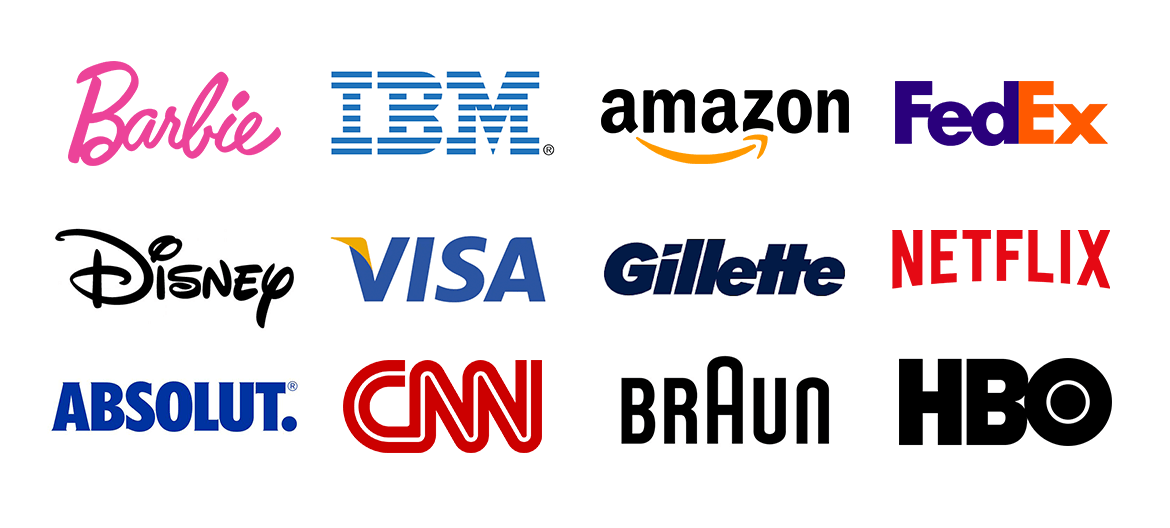
A typographic logo, or logo without a symbol, is a great choice for businesses with an uncommon or memorable name (e.g., Coca-Cola, Yahoo, Facebook, and Google). Using a unique word paired with an interesting typeface is a quick way to create brand recognition.

They’re also great for parent/umbrella companies with many sub-brands or companies where a product or service is an abstract concept with no previously universally recognized or understood symbols. Logotypes also stand the test of time, as they aren’t burdened with trendy or gimmicky imagery.
As Featured in Best Company
This information and more were recently featured in an article by Best Company – a business that strives to empower consumers to make the best decisions and connect confidently with companies that deserve their business.
Examples of the Best Typography Logos

