What Is a Roll-Up Strategy?
A roll-up strategy involves acquiring and merging multiple smaller companies within the same industry to form a larger, more competitive…
Read Article

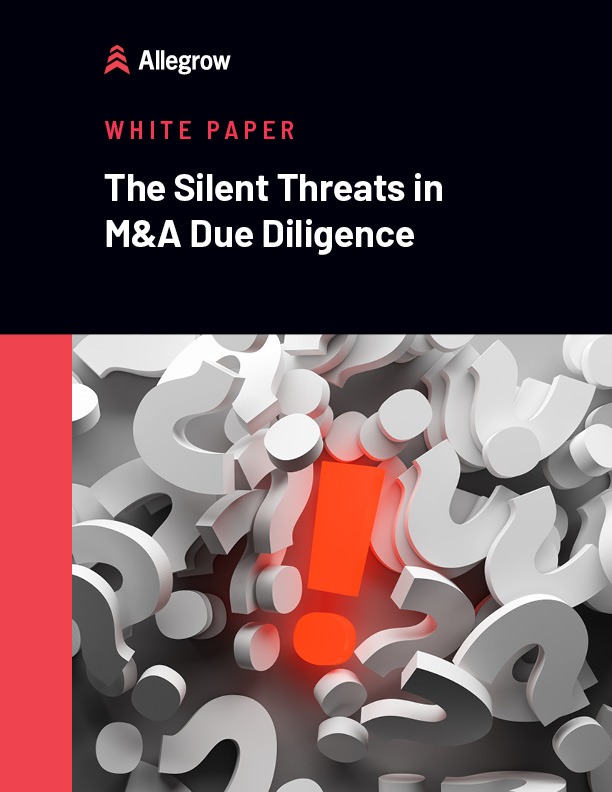
Choosing your next acquisition? Looking deeper than the financials will save you pain and lost profit.
Learn More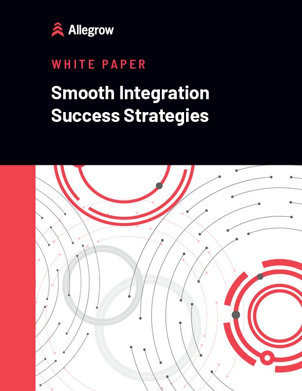
Acquisition complete? It’s time to integrate smoothly and turn challenges into triumphs.
Learn More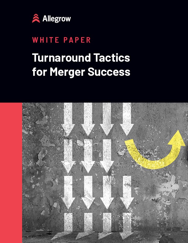
Merger not living up to the board’s expectations? It’s time to fix it.
Learn More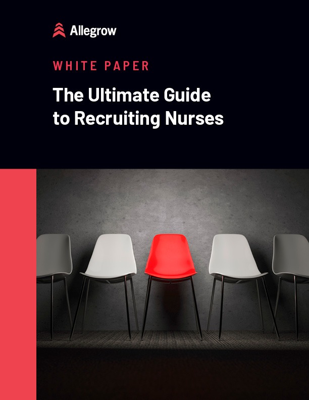
Need nurses now? You must revolutionize your recruitment approach and outpace competitors.
Learn More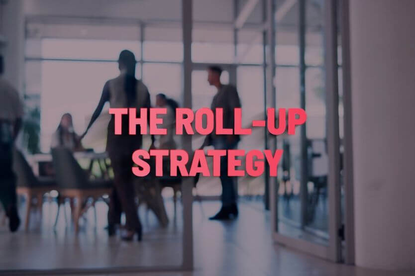
A roll-up strategy involves acquiring and merging multiple smaller companies within the same industry to form a larger, more competitive…
Read Article
In mergers and acquisitions (M&A), due diligence is the critical analysis and evaluation process undertaken by a potential buyer to…
Read Article
Growing your company through mergers and acquisitions (M&A) is transformative. It can enhance market share, increase operational efficiency, and exponentially…
Read ArticleLISTEN NOW //
The Healthcare CEO Show brings together leading voices from across the healthcare industry to delve into the forces shaping healthcare today. From innovation and strategy to culture and technology, we’re on a mission to unearth the insights and stories of healthcare’s most influential leaders.
Learn More About the Show
Length: 34 minutes
Length: 28 minutes
Length: 27 minutes